your first panel
create the simplest possible UI in goo
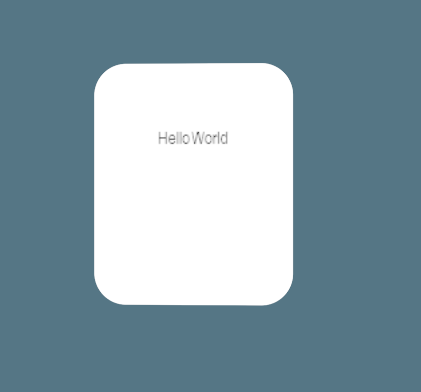
by the end of this guide, you will have text inside a white rounded card
the code
every goo UI is a class that extends GooPanel<T>. the type parameter is the root blob your Build method returns. create Code/Demos/HelloWorldUI.cs with this content, matching the blessed Code/Demos/HelloWorldUI.cs demo (in this repo, the pre-restructure demos live at archive/Code/Demo/HelloWorldUI.cs; the path above is where the published goo site keeps it):
using Goo;
using Sandbox.UI;

namespace Sandbox;

public class HelloWorldUI : GooPanel<Container>
{
    protected override Container Build() => new Container
    {
        Height = 256,
        Width = 256,
        Padding = 24,
        BackgroundColor = Color.White,
        BorderRadius = 12,
        Children = { new Text("Hello") },
    };
}
Container is the standard root type. it holds child blobs and accepts layout and visual style properties. Text is a child blob that renders a string.
add it to a scene
- open the s&box editor to your preferred project and scene
- create an empty GameObject in the hierarchy
- add component:
ScreenPanelorWorldPanel - add component: UI Panels:
HelloWorldUI
press play
you should see a white rounded card with "Hello" inside it.
what just happened
Build returns a tree of blobs. goo renders that tree once and keeps it up to date. the root is a Container with five style properties set directly on construction: Height, Width, Padding, BackgroundColor, and BorderRadius.
style properties are plain C# properties. there is no separate stylesheet step. you set them inline when you construct the blob.
the Children collection accepts any number of child blobs, and they compose into the rendered tree.
add a second line
Children isn't limited to one entry. add a second Text and stack the two top to bottom with FlexDirection:
protected override Container Build() => new Container
{
    Height = 256,
    Width = 256,
    Padding = 24,
    BackgroundColor = Color.White,
    BorderRadius = 12,
    FlexDirection = FlexDirection.Column,
    Gap = 8,
    Children =
    {
        new Text("Hello"),
        new Text("from goo"),
    },
};
FlexDirection.Column stacks children top to bottom instead of the row default. Gap = 8 puts 8 pixels between the two lines so they don't touch. press play and you should see both lines, "Hello" above "from goo".
note: verify in s&box. this two-line variant is not itself a checked-in demo, so treat the exact spacing as unverified until someone runs it in a live panel.
arranging children takes FlexDirection, Gap, and AlignItems further with a second child that also does something.
show a line only when you have one
a real second line is often conditional, not a fixed literal. a nullable ternary directly in the Children initializer adds a child only when the condition holds:
private string? _subtitle = "from goo";

protected override Container Build() => new Container
{
    Height = 256,
    Width = 256,
    Padding = 24,
    BackgroundColor = Color.White,
    BorderRadius = 12,
    FlexDirection = FlexDirection.Column,
    Gap = 8,
    Children =
    {
        new Text("Hello"),
        _subtitle is { Length: > 0 } ? new Text(_subtitle) : null,
    },
};
set _subtitle to null or "" and the second line disappears entirely; goo skips a null child silently. only the branch you take gets evaluated, so an unused subtitle never builds a wasted Text.
note: verify in s&box. this conditional-subtitle variant is not itself a checked-in demo, so treat it as unverified until someone runs it in a live panel.
see also
- the model - how goo's tree works, in more depth than this walkthrough needs
- build method - how
Build()works and when it re-runs - container - layout and visual properties available on
Container - text - properties available on
Text - styles - full reference for style properties
- arranging children - add multiple children and control layout
- your first counter - add state and interactivity to your panel